A possibly annual softball outing involving family members and a few friends of the fam came about this summer and we needed a name and t-shirts. So a steady flow of text messages amongst my comrades evolved into something catchy and fun. I drew up a mock graphic and sent it off for peer editing. Once approved I drew up the logo and we had our team name and look ready for the shirts. We lost all three games, but looked shnazzy as hell doing it. Next year. Click the logo for a bigger version.
Wednesday, June 9, 2010
Mooseknuckler's Logo
A possibly annual softball outing involving family members and a few friends of the fam came about this summer and we needed a name and t-shirts. So a steady flow of text messages amongst my comrades evolved into something catchy and fun. I drew up a mock graphic and sent it off for peer editing. Once approved I drew up the logo and we had our team name and look ready for the shirts. We lost all three games, but looked shnazzy as hell doing it. Next year. Click the logo for a bigger version.
Blue Moon Band Poster #18

This might perhaps be my favorite of the twenty some posters i've had the pleasure of doing over the years for the Blue Moon Band. They were playin out at The Ickey Nickel bar and I wanted to do something different. I scraped the first idea and decided to take on an idea I had on the way home from work. I grabbed a nickel, threw on some toothpaste, mixed in some lint from the dryer and worked it around a bit, cleaning areas as I went. I then laid it on the dryer and got as much light around it as I could. I took a macro shot with my camera and got a pretty neat pic. I enhanced some of the colors on the gunk and added a green funk to please all senses. I rarely do a white background ad or poster, but think I should do more. It's always so clean and bright.
Blue Moon Band Poster #17

There was this caboose sitting across from work in the middle of a major railroad junction for a few months. I looked at it just about every morning at evening when I finally decided to walk over there and take a few snaps of it. I was lucky enough to sit down in a sort of ditch that elevated the car above me quite a bit. It gave it a pretty cool dramatic effect. I then did some tone mapping and cloned out the original text on the car only to replace it with some of the info for the upcoming gig. Typography is tough work most of the time, it's kinda nice to actually coe up with a plan for text before hand, in stead of just throwing it in later.
Kreative Juice Box Logo Design
I decided to add a flashy logo and colorful look to my freelance enterprise. I bring to you..... Kreative Juice Box. Yep. It's where all the juicy stuff happens. A play off of the always alluring and sometimes hazardous synapses of creative idea and thought tucked neatly into a nice little squeezable box. Slogan you ask? "Let's get em flowing" is kinda what I had worked up. It has a tie to the name and is somewhat subliminal in nature. Giggity.
Blue Moon Band Poster #16
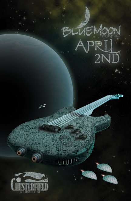
Sometimes great ideas actually work out well. I discussed with my dad a few ideas I had for upcoming shows when he came up with the Guitar mothership idea. So we continued the Blues Invasion tour with the addition of this poster design. The guitar is/was a photo of the band's guitar player's guitar. I found a neat texture online and wrapped it around the guitar, added a few fighter picks for depth and another moon in the background that utilizes another texture that I have in my neato-dorito arsenal of texture picks that i've taken over the years.
Blue Moon Band Poster #15
 Holidays always give an opportunity to intermingle ideas, shapes and colors where they might not have been conceived of otherwise. So here is St. Paddy's Day poster design using a great color scheme accompanied by a collage of shapes. The hardest part is proximity to tell you the truth. But it worked out in the end. My favorite part has to be the use of one of my texture pics in the background.
Blue Moon Band Poster #14
 So, the idea was great. Make a Valentine's event poster and tie it to the band by having it look as if an astronaut decided to draw a heart around the bands logo in moon dust. I managed to find, after some good time, a decent size pic of the footprint on the moon and just flipped it and tried hard to make it look like the left boot and not a flipped-replica of the right boot. Some areas good use some retouching now that I take another look.
Alternate Blue Moon Band Logo

Blue Moon Band Poster #13
 Here's one that should give anybody a good laugh. I kinda wanted to come up with a vintage Freakshow poster look. So I grabbed some photos of the guitar player and the bass guitar player and made vector solids out of them. This is also the first poster I decided to use the "alternate" Blue Moon Band logo on. I thought it was just too perfect-a-fit not to. Im starting to realize that adding unusual shapes to fill space kinda works.
Blue Moon Band Poster #12
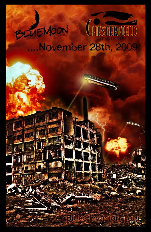
So they were tearing the old stockyards building "KD Station" when it hit me. Why couldn't they just bring in some unidentified flying harmonicas to do the demo? But actually, I had my dad, harmonica player for the Blue Moon Band, go down and get some pics. He was almost run over by work trucks in the process and got kicked out of there pretty quick. But he managed to take a good amount of neat pics. So I gave the destruction a sort of "hot look" for lack of a better term. Added some harmonicas from another pic I took, a few dashes of laser, and a splash of apocalyptic mushroom clouds later... walah. I give you the Blues Invasion Tour, Version 1.
Subscribe to:
Posts (Atom)