 I know what you're thinking, "Does no one else on the planet need a poster?" Well, the answer is probably yes, but I am lucky enough to have these guys let me loose and get creative push myself with new ideas. Not only that, but the band might be viewed as always fresh and believe it or not, people collect these things and look forward to new ones. My belief is that people look at a shoe poster once or twice, and then disregard it in the future whether there is new information on it or not. So, keep them interested right? I don't know. So, this one is once again a collage of photos that were taken. The semi, by my dad, the guitar in my kitchen and the road.... well the road was used from some stock photography. Combine all ingredients, whisk until all lumps are gone, a dash of salt. The tastiest show on earth. I used this font, cause I wanted one that could have been used a century ago. And didn't steal away from the images too much. Although, I wish there wasn't as much type. But oh wells. Oh, and I generated it half tone just to push the theme.
Thursday, September 30, 2010
Blue Moon Band Poster #20
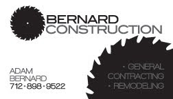
I know what you're thinking, "Does no one else on the planet need a poster?" Well, the answer is probably yes, but I am lucky enough to have these guys let me loose and get creative push myself with new ideas. Not only that, but the band might be viewed as always fresh and believe it or not, people collect these things and look forward to new ones. My belief is that people look at a shoe poster once or twice, and then disregard it in the future whether there is new information on it or not. So, keep them interested right? I don't know. So, this one is once again a collage of photos that were taken. The semi, by my dad, the guitar in my kitchen and the road.... well the road was used from some stock photography. Combine all ingredients, whisk until all lumps are gone, a dash of salt. The tastiest show on earth. I used this font, cause I wanted one that could have been used a century ago. And didn't steal away from the images too much. Although, I wish there wasn't as much type. But oh wells. Oh, and I generated it half tone just to push the theme.Bernard Construction Logo Spread and Business Card


Blue Moon Band Poster #19
 Yet another. The idea was again pretty good, but didn't follow the event. I'll explain. The venue, Ickey Nickel, the event, Ragbrai. So instead of incorporating some sort of bike theme into the poster, I decided to take on one of the ideas that floated around during the last Ickey Nickel show poster. And so I present the nickel stuck to the buttom of a dirty shoe with gum of course. There are once again some new things in this poster, such as the block type at the bottom that I don't always do, but this allowed for it. I thought I would italicize the type as well, which I don't always do, because I thought flow of the poster was "moving" from right to left. And the white space turned out nice, I think. As for the images. The legs belong to my 3 year out boy Cayden and the boots he is wearing are uncall Nate's. The ground is actually a photo I took in a drunken jaunt through old town omaha. Old brick roads just beg to be captured in blissful digital imagery. We go every year for St. Pat's. How do you like the faux shadows of the strings and shoes? Talk amongst yourselves.
Subscribe to:
Posts (Atom)